ADCN Yearbook
Voor het Art Directors Club Netherlands Yearbook werden twaalf studio’s uitgenodigd om een unieke cover te ontwerpen. Daaruit ontstond een gedachte: wat als een boek emoties zou kunnen hebben?
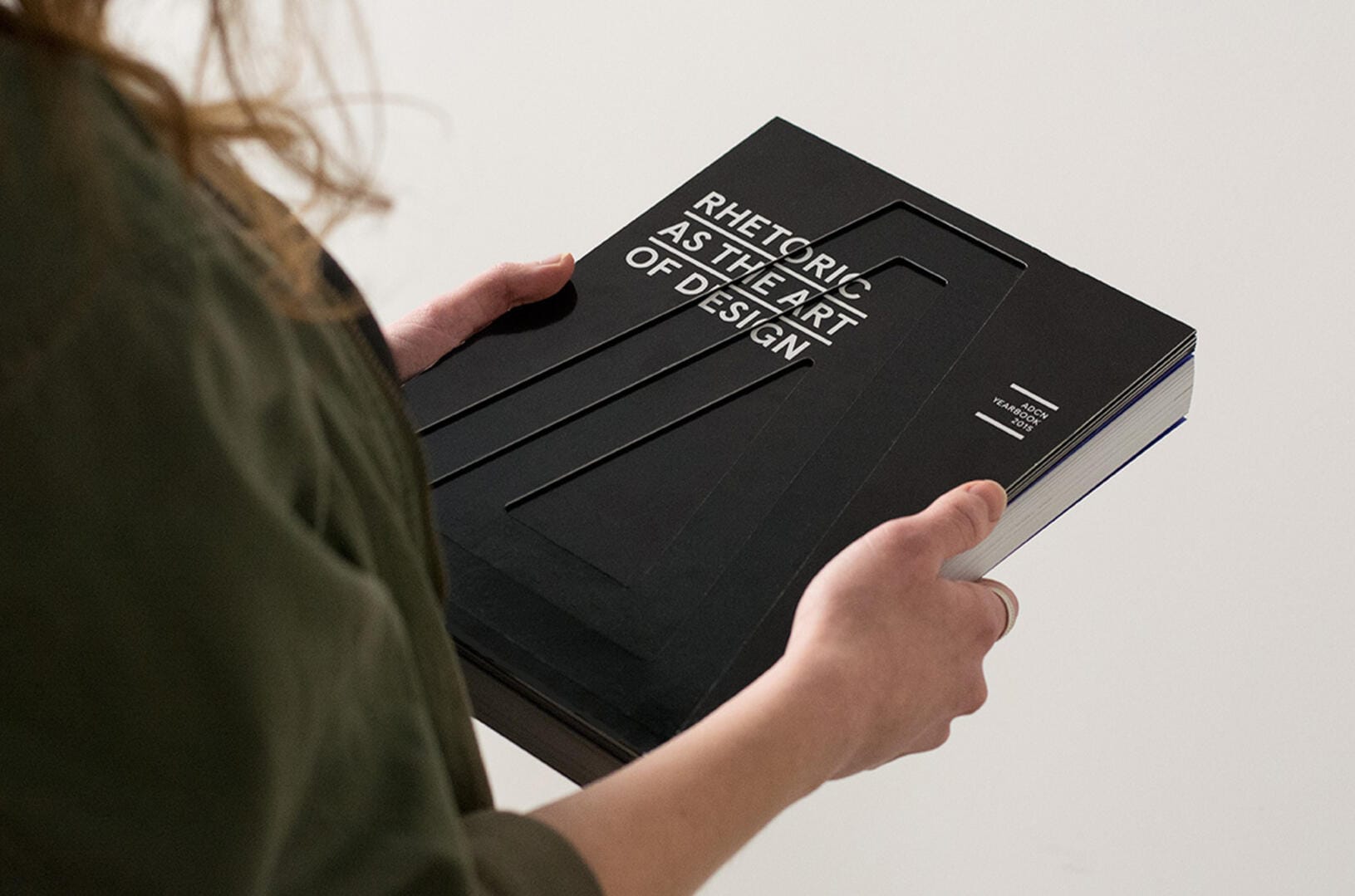
Veel prachtige designboeken eindigen als trofee op een plank. Bewonderd, maar nooit geopend. Het beeld ontstond van boeken die langzaam vervagen door verwaarlozing, om weer op te lichten zodra iemand ze eindelijk oppakt.
Precies dat werd ontworpen: een boek dat reageert op aandacht.
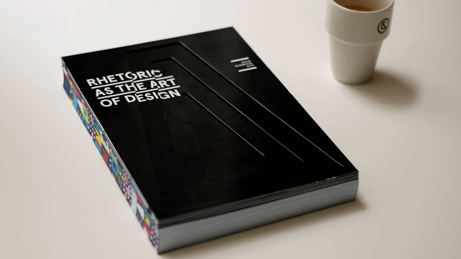
De cover maakt gebruik van warmtegevoelige inkt en verborgen bewegingssensoren. Onaangeraakt blijft het boek zwart, stil en teruggetrokken. Zodra het wordt opgepakt, activeert de beweging een systeem dat de cover subtiel verwarmt en het ontwerp zichtbaar maakt.
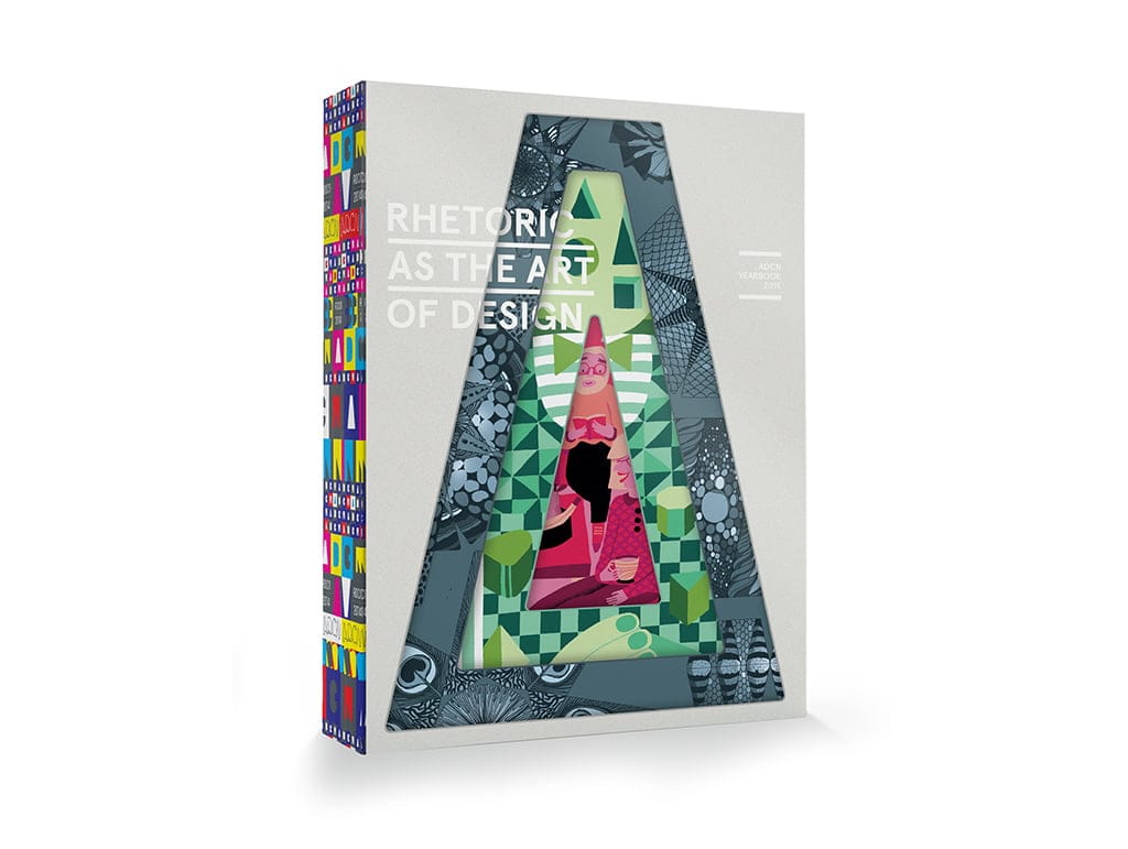
De cover is opgebouwd rond het thema Rhetoric as the art of design.
Net zoals retoriek gebruikmaakt van logos, ethos en pathos om mensen te raken, balanceert design tussen logica, geloofwaardigheid en emotie. Drie illustratoren werden uitgenodigd om elk een van deze klassieke pijlers te interpreteren, samengebracht in één gelaagde compositie.
Een boek dat voelt wat elk creatief werk voelt: de vreugde om gezien te worden.