The Quiet Sublime - Designing public spaces that move people without saying a word
Some places don’t shout.
They hum.
You step into them and the air feels charged, as if something invisible has gathered there: waiting for you to notice. These places don’t overwhelm you with information or spectacle. They hold back. They create tension, silence, and space, and in that restraint they make you feel something real.
This is the quiet sublime: the art of designing for emotion not through noise, but through precision, stillness, and courage.
Below are examples of places that embody this philosophy and what they teach us about designing spaces that move us in deeper, quieter ways.
Vietnam Veterans Memorial
📍 Washington DC, USA

To design for feeling takes daring. It’s much easier to explain yourself, to add texture, imagery, sound, or story, than to strip everything away until only essence remains.
At just 21, Maya Lin proposed a memorial that wasn’t a statue or symbolic figure. She cut a wound into the earth: two black granite walls descending into silence, inscribed with names.
The design was rejected by many at first. Too dark, too empty, too abstract.
But its silence became its power.
The polished stone reflects your own face among the names, merging you with the memory. You are pulled into the loss, not as a spectator but as a participant.
What it teaches us:
Restraint can be radical. When you remove everything but truth, emotion rises to meet the void.
9/11 Memorial
📍 New York, USA
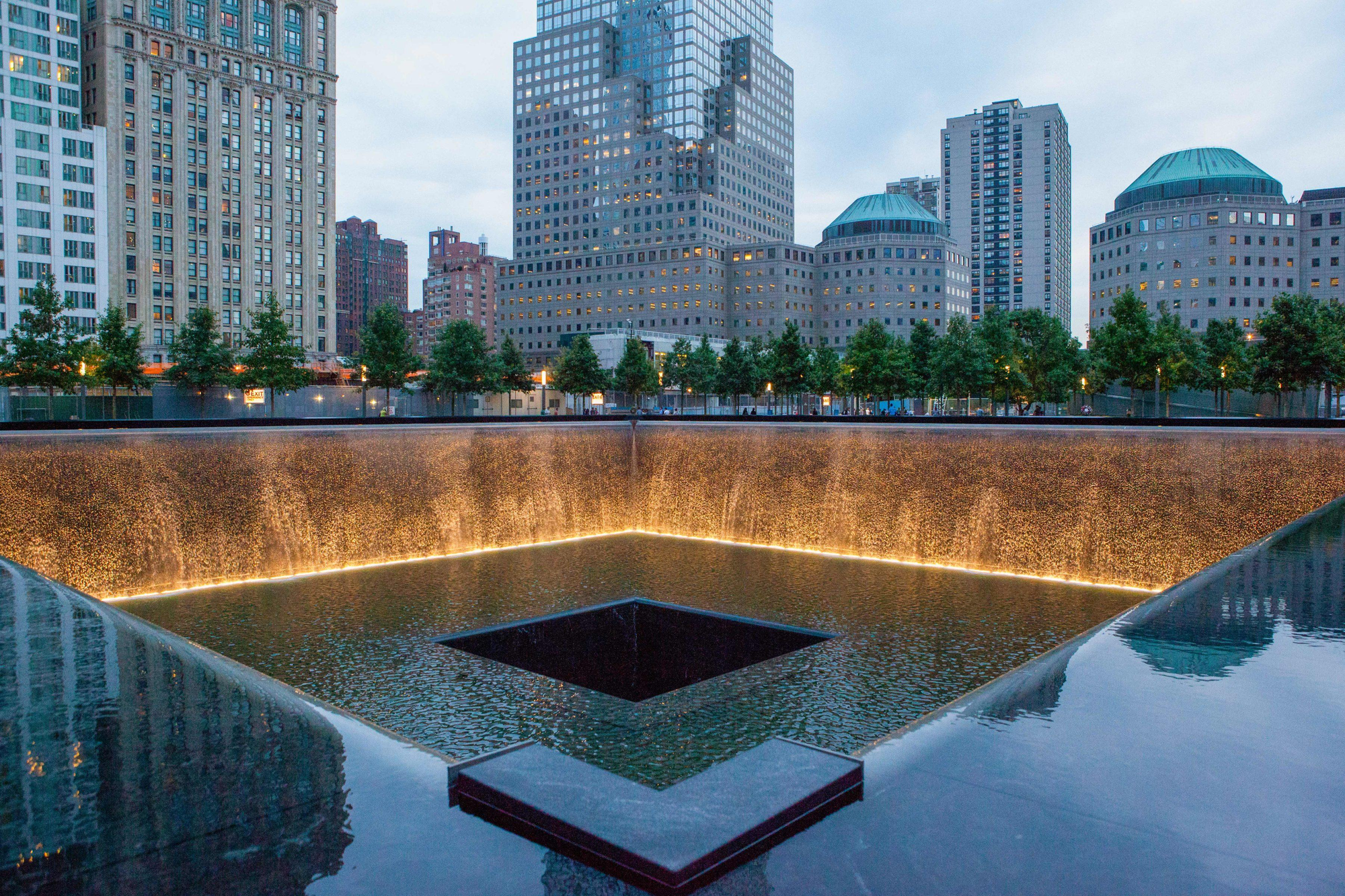
At the 9/11 Memorial in New York, architects Michael Arad and Peter Walker filled the footprints of the towers not with new buildings, but with falling water. Two vast voids draw the eye and the ear downward.
You stand at the edge and look into absence. And in that absence, you understand the scale of what’s gone.
No words, no statues, no explanations. Just gravity, sound, and memory.
The memorial doesn’t depict grief. It embodies it.
What it teaches us:
A space doesn’t need to depict grief to express it. Sometimes presence emerges most powerfully through what is missing.
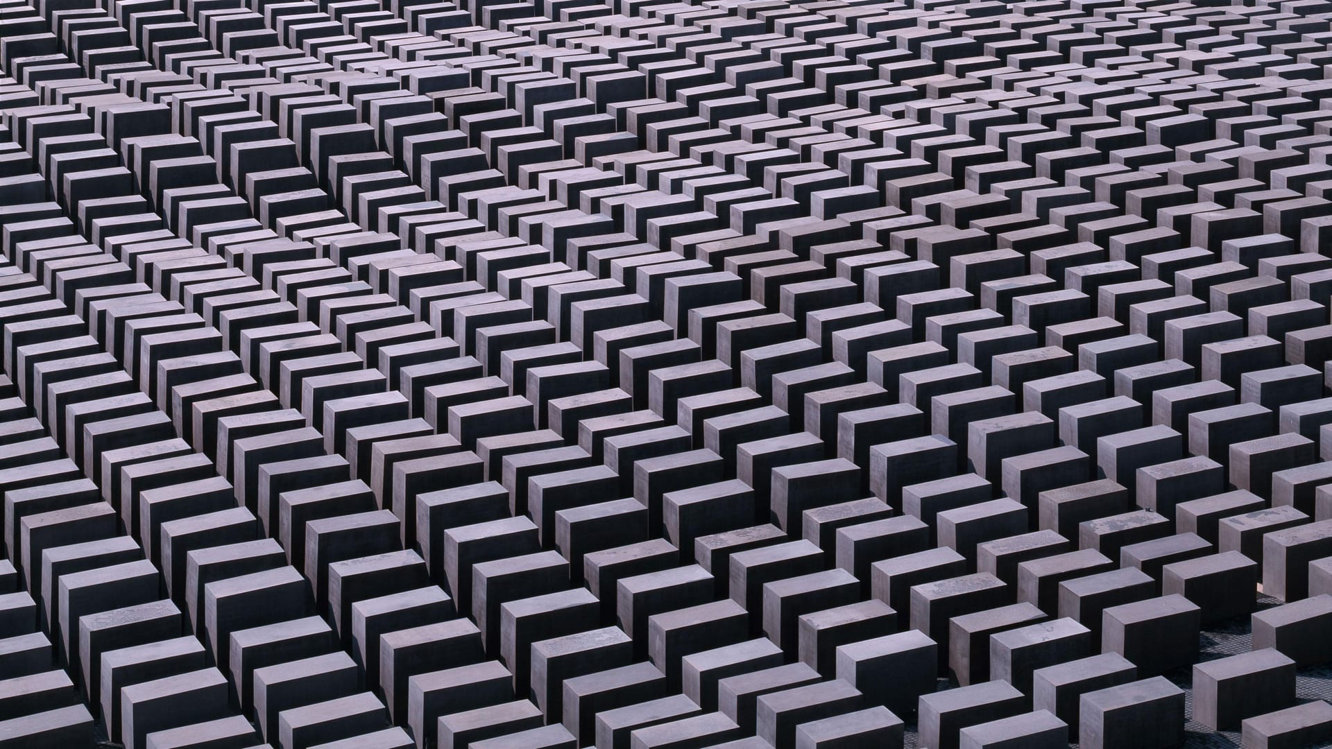
Holocaust Memorial
📍 Berlin, Germany

In the centre of Berlin, Peter Eisenman’s Holocaust Memorial stretches across an entire city block. A field of 2,711 concrete stelae, identical in footprint yet varied in height, forming a landscape that is both ordered and disorienting.
From the outside, it appears almost calm: a grey grid, silent and still.
But as you walk between the slabs, the ground dips and rises. The walls grow taller. Light thins. The city disappears. You find yourself alone in a narrowing corridor of stone, without bearings, without horizon.
Nothing tells you what to think.
Nothing explains what the forms represent.
The memorial relies on architecture as emotion, geometry as memory.
The experience is not symbolic. It is physical.
You feel the structure closing in, the scale shifting around you, the quiet pressing inward. The design refuses metaphor and instead creates a spatial condition where disorientation becomes a form of remembrance.
What it teaches us:
Abstraction can be devastating. When a place removes narrative and leaves only form, space itself becomes the memory. The quiet carries the weight.
Roden Crater
📍 Flagstaff, USA
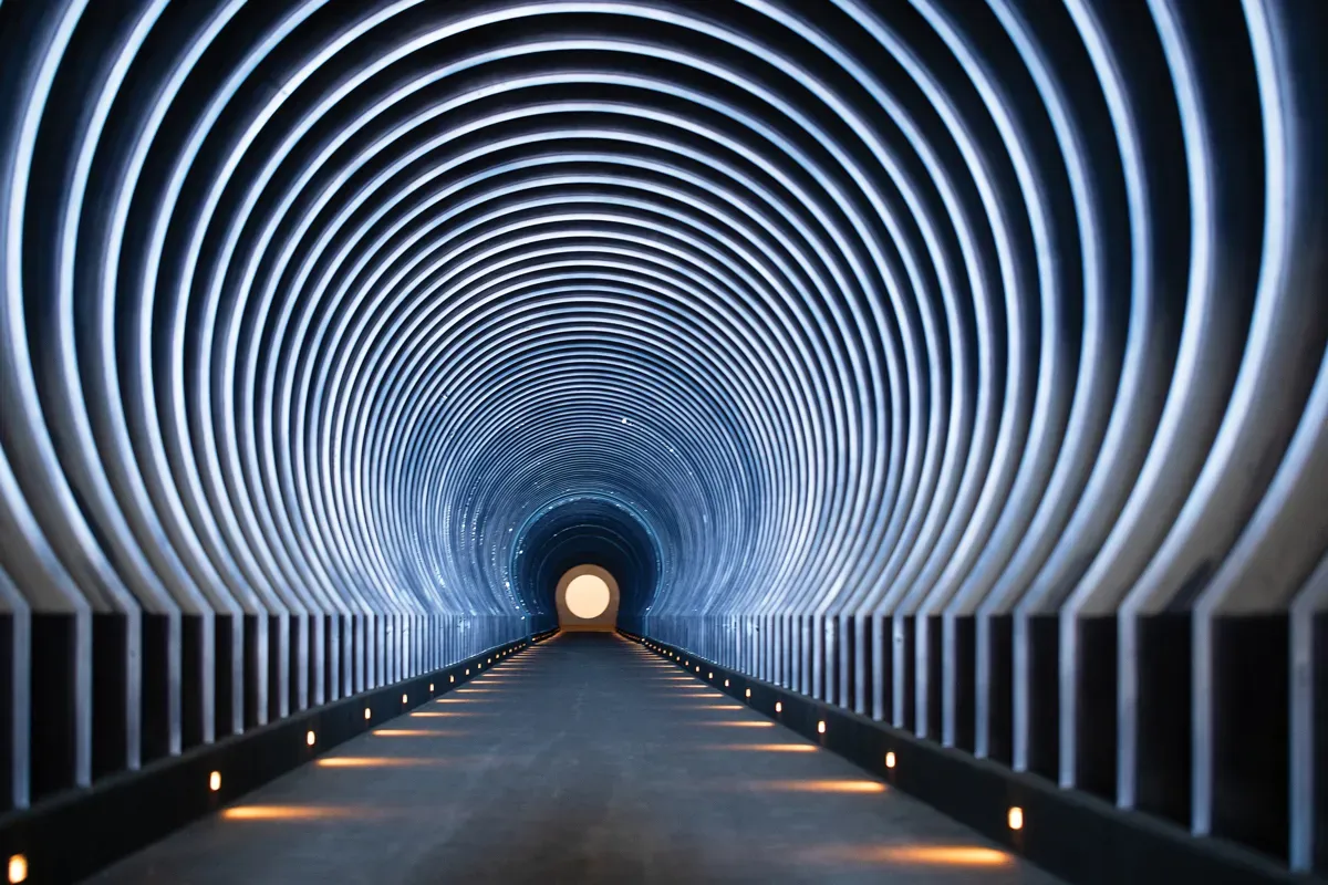
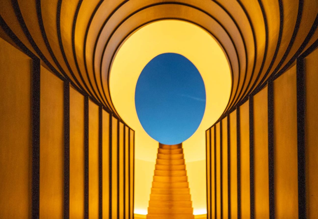
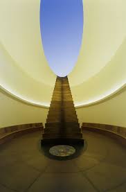
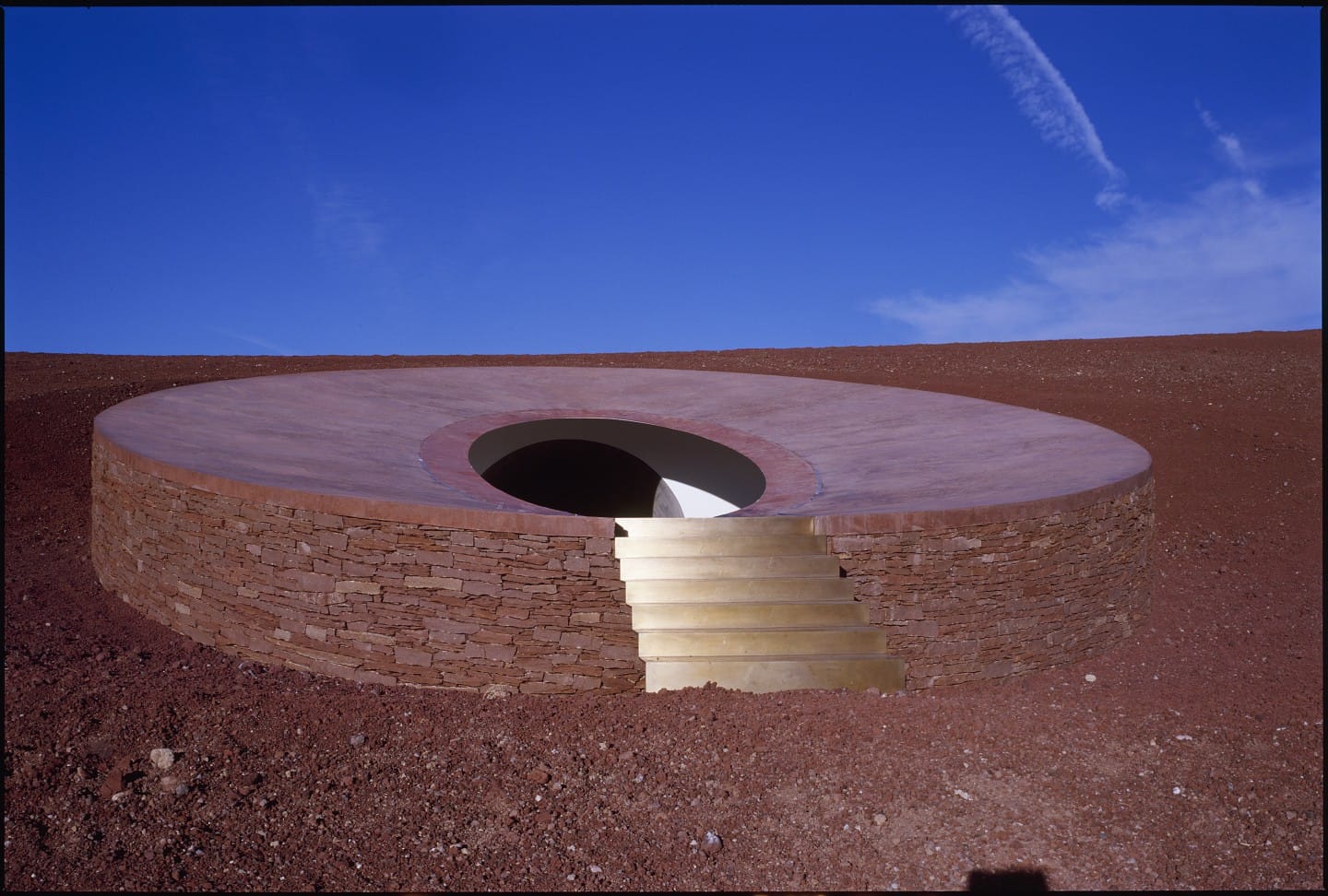
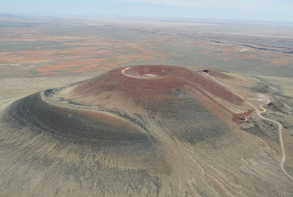
The Roden Crater
In the Arizona desert, James Turrell has spent half a lifetime hollowing a volcano to make Roden Crater.
You walk through darkness to find the sky. Framed with mathematical precision so that sunrise, moonlight, and starlight feel tangible.
There are no images or messages. Turrell designs with light the way others design with stone. He shows that the most powerful materials are the ones that cannot be touched.
The space between earth and sky becomes a living instrument, tuned to perception itself.
What it teaches us:
The intangible can be a material. When perception becomes architecture, emotion becomes undeniable.
Steilneset Memorial
📍 Vardó, Norway

On the Arctic coast of Norway, Peter Zumthor and Louise Bourgeois built the Steilneset Memorial, a slender wooden corridor for the women burned as witches.
It’s narrow, cold, and endlessly linear: 91 windows, each holding a light for a life lost.
The structure doesn’t dramatize history; it listens to it.
Wind moves through the boards, sea mist seeps in.
You feel the exposure those women endured.
The restraint is respect.
What it teaches us:
Restraint is a form of respect. When design steps back, the truth of a place can step forward.
The Principles of the Quiet Sublime
What unites these places isn’t a style. It’s a set of principles.
- Tension, not comfort.
They hold you in anticipation. You lean forward, you listen, you wait. - Honesty of materials.
Stone, water, light, wood — nothing unnecessary, nothing disguised. - Precision of proportion.
Your body senses the scale before your mind interprets it. - Absence as structure.
What’s missing carries more weight than what’s there. - Trust in the visitor.
They don’t tell you what to feel. They leave space for you to find your own meaning.
These works aren’t minimal; they’re deliberate. Every omission is intention. Every silence is designed.
The courage to hold back
We live in an age of amplification. Museums compete for spectacle. Cities race for icon status. Designers are told to be bold, visible, shareable.
But quiet can be radical.
To make less, to leave space, to trust the human heart. That’s harder than any display. Because to do so, you must believe that people still know how to feel on their own.
The quiet sublime lives in the space between things.
Between earth and sky, sound and silence, presence and loss.
It’s where emotion gathers, unspoken but undeniable.
To design for that space is to trust tension over clarity, restraint over abundance, truth over noise.