TWIL #48: From visualizations to insights

Every Sunday, I write down a few things that caught my attention that week: details I tripped over, ideas that lingered, questions I needed to understand by putting them into words. This isn’t about being right or complete. It’s about noticing, wondering, and thinking on the page.
Thanks for reading. I hope something here sparks.
When data visualization makes all the difference
While listening to a Dutch history podcast about Florence Nightingale, I realized her most radical act wasn’t caring for the wounded. It was drawing.
Florence Nightingale: making death visible
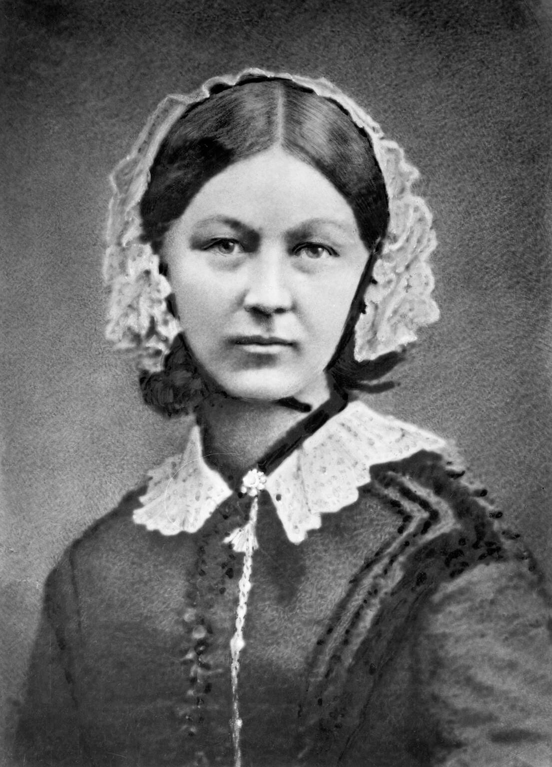
Florence Nightingale went to military hospitals during the Crimean War to improve care for wounded British soldiers. What she encountered shocked her. Soldiers weren’t dying from their injuries. They were dying after they survived them. Hospitals were overcrowded, poorly ventilated, and unsanitary. Sewage ran under floors. Clean water was scarce. Basic hygiene was absent. She began to measure what others only sensed.
She had the numbers.
She had the comparisons.
She had the proof.
But she was speaking to people who didn’t want to hear it.
Reports were ignored. Tables were unread. Reform was postponed.
So she changed strategy. She translated her insights it into the very first polar area diagram:
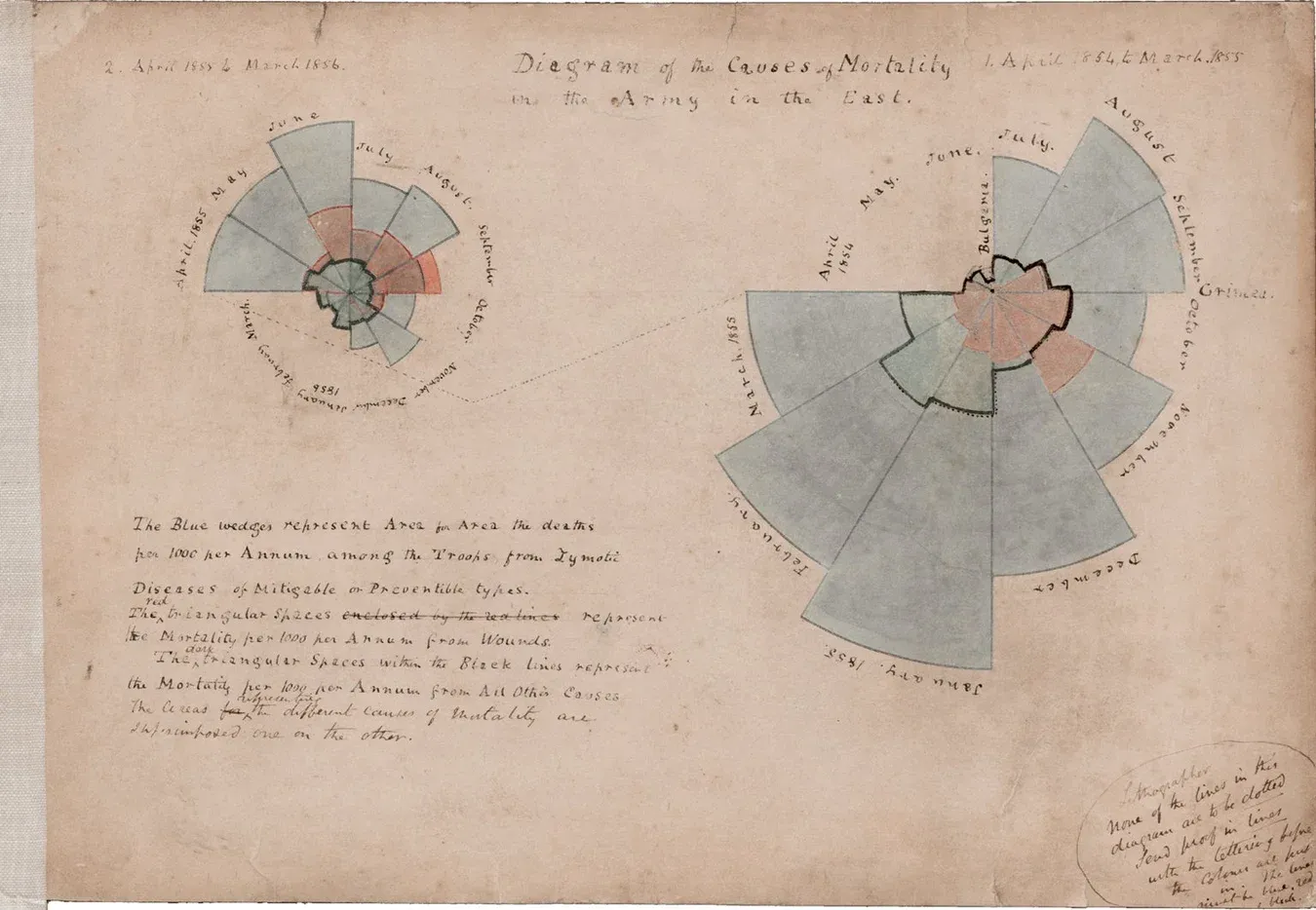
Disease overwhelmed combat visually. And the problem became impossible to ignore.
It reminded me of another visualization, by Minard.
Charles Joseph Minard: showing loss over time
Charles Joseph Minard was a French civil engineer. Decades after Napoleon’s failed invasion of Russia, Minard wasn’t trying to glorify or condemn the campaign. He was trying to understand why it failed so completely.
Written histories existed. Casualty numbers were known. But the scale and progression of loss remained abstract.
So Minard drew the campaign as a map. It has become an iconic data visualization. It almost hurts to look at it.
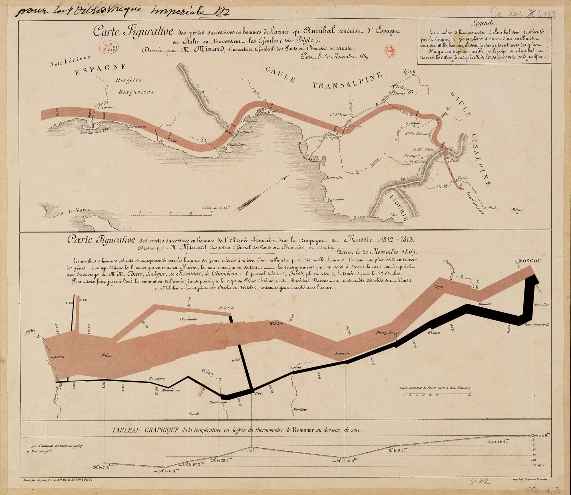
The width of the line is the army size: thousands of men compressed into thickness. As the march continues, the line thins. Not after a single battle, but steadily. Loss without spectacle.
Then the line turns back at Moscow. Now it collapses. Along the bottom, temperatures plunge. Dates tick forward. Winter arrives. The retreat happens under cold so severe it becomes part of the argument.
By the time the line reaches its starting point, it is barely there. No rhetoric. No judgment. Just a visual that lets you see, immediately, what this campaign cost. It started with 600,000–685,000 men and ended with 50,000–100,000 men.
That is the power of a strong visual.
John Snow: revealing a cause
John Snow was a physician in 19th-century London.
In 1854, the city was hit by a deadly cholera outbreak. Most believed the disease spread through “bad air.” Snow suspected otherwise, but suspicion wasn’t proof. He needed a way to see the pattern. So he started plotting each cholera death as a dot on a map:
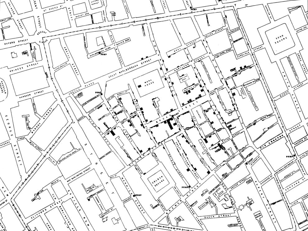
A simple exercise, but with huge impact. It revealed a clear cluster around a single water pump.
The pump handle was removed. The outbreak slowed.
The map didn’t explain cholera. It showed where to act.
What they share
All three point to the same insight: visualizations can be more powerful than words. Not because words don’t matter, but because seeing removes negotiation.
So what insight would you turn into a visualization? And what would you stop trying to explain?
Things I bumped into online
Small discoveries from wandering the web, without a plan.
→ Roman roads, beckoning wanderers
Itiner-e — an interactive map tracing Roman roads across Europe, a reminder that movement used to be the map.
https://itiner-europe.eu/
→ How to Lay Siege to a Medieval Fortress (1000-1300
An unexpectedly methodical guide to waiting things out and letting systems do the work. You never know when this might come in handy..
https://www.youtube.com/watch?v=aQ7hTNoK-OA
→ Closer to Johannes Vermeer
Dive into the world and work of Johannes. A beautiful interactive piece by my friends at Q42 and Fabrique. Love it.
https://www.rijksmuseum.nl/nl/johannes-vermeer
None of these felt urgent.
They just stayed with me.
History coming alive thanks to AI
I love how this video makes history come alive.
AI isn’t new, and this isn’t the first example. But what it does show is how we can breathe life into the past and experience stories in a way that feels vivid, human, and immersive.This is storytelling at a new level. And what makes it even more exciting is that this was created with tools easily available to you and me. No special knowledge required: just curiosity, creativity, and a passion for telling stories that matter. History doesn’t have to feel distant anymore.
Want to do something like this for your project? Let me know! I would love to work on something like this. 😀
When insight travels sideways
I was looking at Darwin’s work, searching for inspiration for an article, when I stumbled onto something unexpected.
An economist.
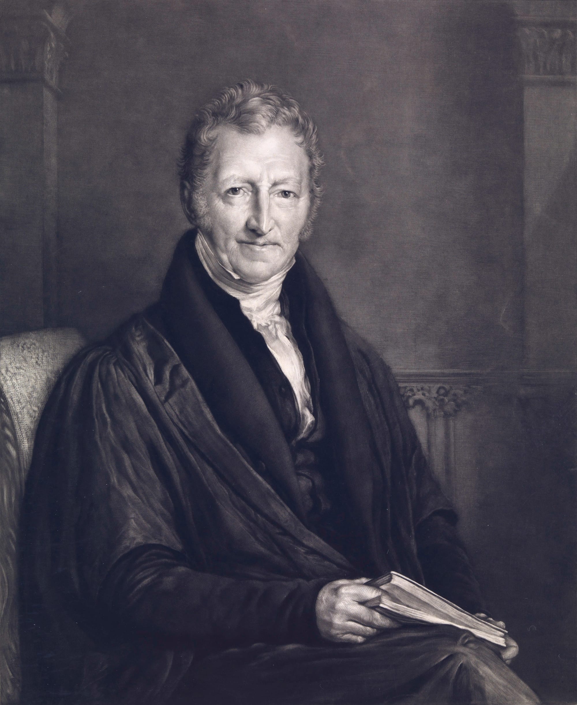
Darwin’s key insight into evolution didn’t arrive only through observation of nature, but through a book written decades earlier by Thomas Malthus: An Essay on the Principle of Population, first published in 1798.
At the time, it was a radical idea.
Malthus challenged the belief that progress naturally improved life for everyone. He argued that population growth would always outpace resources... not because of mismanagement, but because of mathematics.
“The power of population is indefinitely greater than the power in the earth to produce subsistence for man.”
His argument was stark, almost visual (With a decent data visualization, the essay could’ve been a pamphlet...).
Population grows like this:
1, 2, 4, 8, 16.
Food production grows like this:
1, 2, 3, 4, 5.
Pressure isn’t an accident.
It’s inevitable.
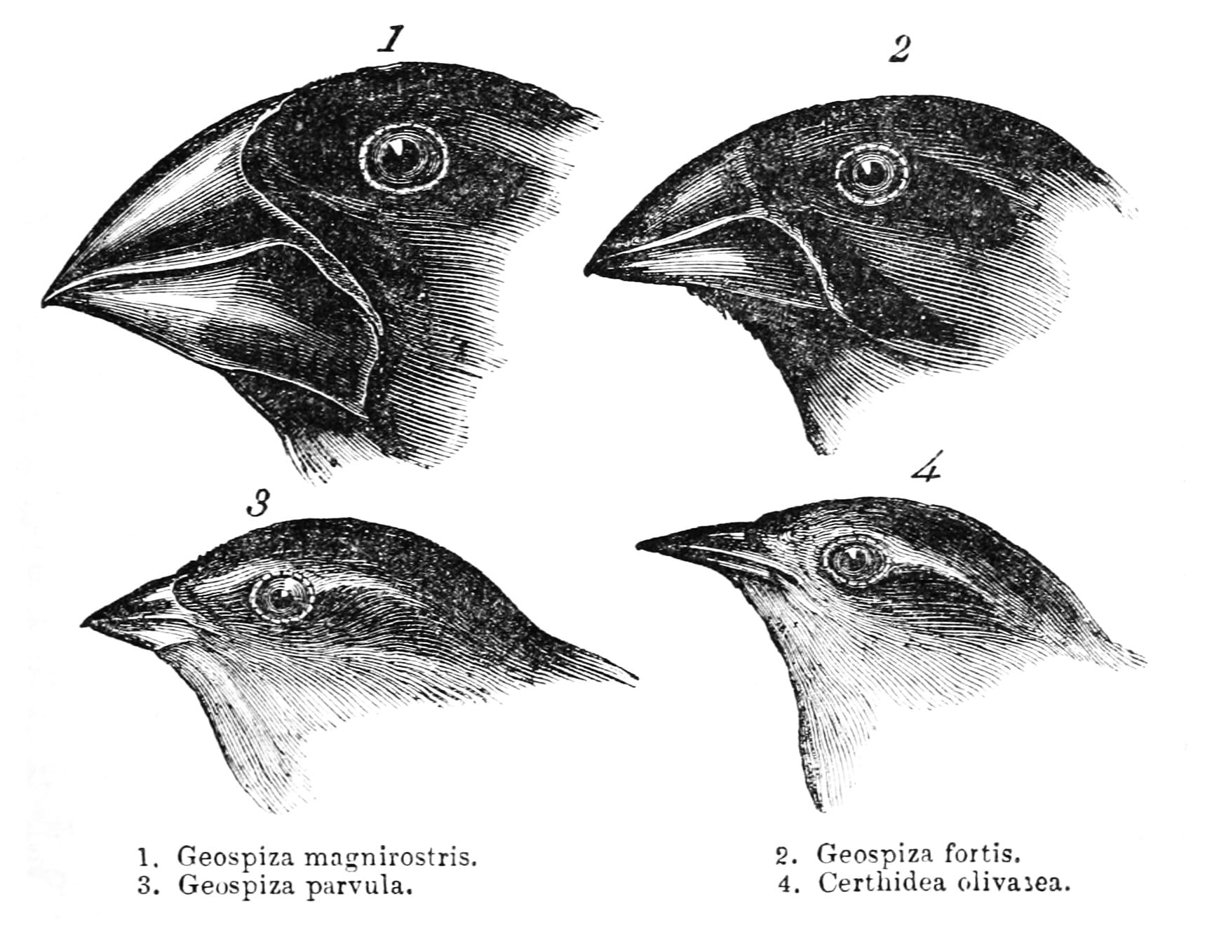
Darwin immediately saw what this meant for nature.
If more organisms are born than can survive, then every environment becomes selective. Small differences matter. Slight advantages compound. Over time, pressure shapes populations.
Malthus explained why pressure exists.
Darwin recognized what pressure does.
Natural selection wasn’t invented in isolation.
It emerged from a connection.
Darwin didn’t just look harder at nature.
He borrowed a model from economics and noticed where else it applied.
That’s the real insight
Understanding doesn’t always come from more detail.
It comes from the right lens.
Darwin didn’t add facts.
He changed perspective.
So the invitation is simple:
what are you looking at that might make more sense through a different lens?
That’s it for this week.
A reminder that sometimes the work isn’t to explain more, but to find the right way to see.